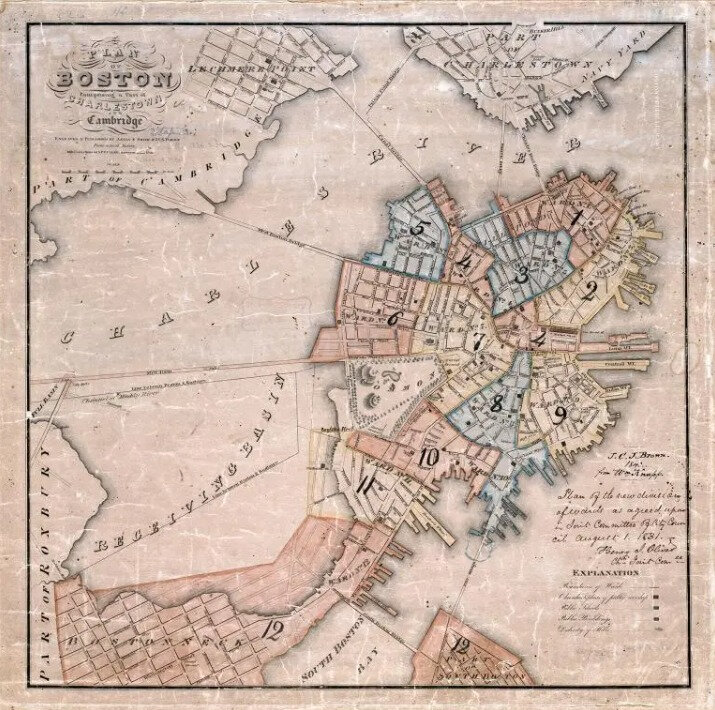
An 1826 map of Boston showing the present-day Back Bay area marked as the “Receiving Basin,” before it was filled and developed into land.
The problem
A coastal city on borrowed ground
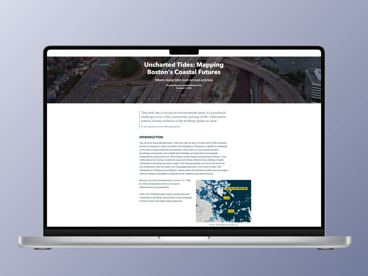
Sea levels off the Massachusetts coast are now rising by roughly an inch every eight years, and the pace is accelerating. For most coastal cities this is a slow threat. For Boston it is a structural one. Nearly a sixth of the city sits on land that was once tidal flats, marsh, or open water, filled in over the 18th and 19th centuries to expand a peninsula that was always too small.
That borrowed ground is exactly where the water is coming back. Climate Ready Boston projects two to seven feet of sea level rise by 2100, with more than 700,000 people living in flood-vulnerable neighborhoods. The risk is not abstract or distant, it is mapped onto the same blocks where people commute, work, and live.
The data exists. NOAA publishes it, the city republishes it, and most residents have never looked at it. Our question was not how to find new numbers, it was how to make the existing ones impossible to scroll past.
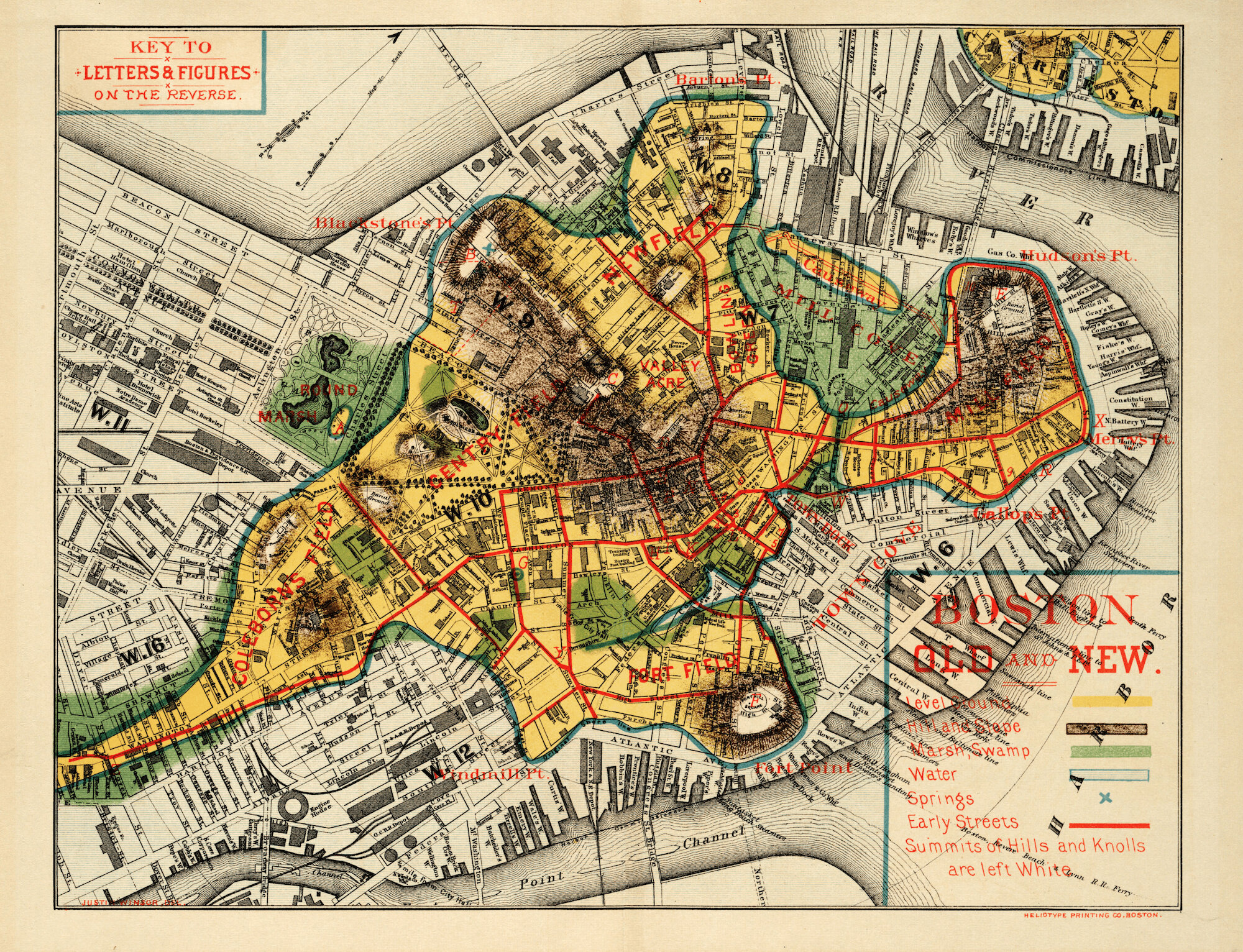
Justin Winsor, “Boston Old and New” (1880). The original Shawmut peninsula shown in yellow, superimposed on the city as it stood in 1880.
Background
Where the water used to be
To understand which parts of Boston are most at risk, it helps to see what the land used to look like. The Shawmut, the original peninsula the colony was settled on in 1630, was a narrow tongue of high ground connected to the mainland by a single causeway. Everything else was water, marsh, or mudflat.
Justin Winsor's 1880 map “Boston Old and New” lays the outline of that original Shawmut directly over the 1880 city grid. The yellow shape is what existed before landfill. Everything outside it, including Back Bay, the South End, and much of the waterfront, is reclaimed ground. The clearest example is the Back Bay itself, marked “Receiving Basin” on an 1826 plan, a dammed tidal basin that was later filled in to become some of the city's most desirable real estate.
The coastline is not a fixed line. It is a record of decisions. Rising water rewrites the record.
The process
Five sea levels, one coastline
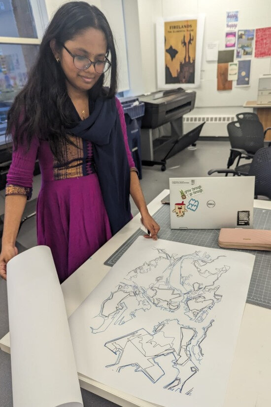
Using NOAA's Sea Level Rise Viewer, we pulled inundation extents for Mean Higher High Water and five rise scenarios: 2, 4, 6, 8, and 10 feet. In ArcGIS we extracted each shoreline as a separate vector layer, then cleaned and stacked them in Illustrator. Each line is the same place, the same coast, just under a different future.
An early digital prototype used a saturated dark background with neon strokes to show even a 1-foot rise. It read as activist-poster, urgent but easy to dismiss. We sat with it briefly as the answer, until we realized a screen wasn't going to make this data stick.
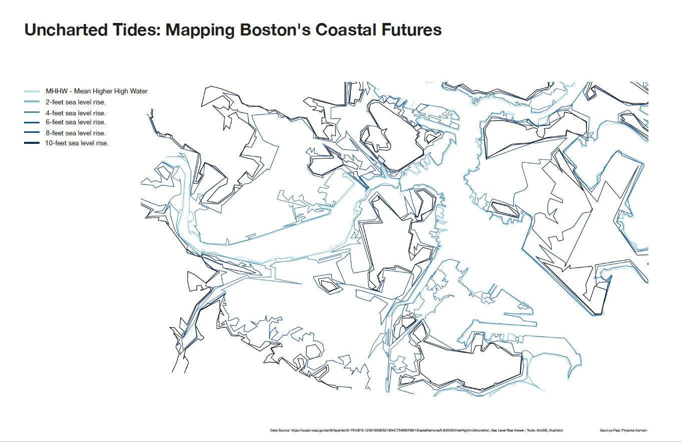
The composite map: MHHW plus 2, 4, 6, 8, and 10 feet of rise, ArcGIS extraction cleaned in Illustrator.
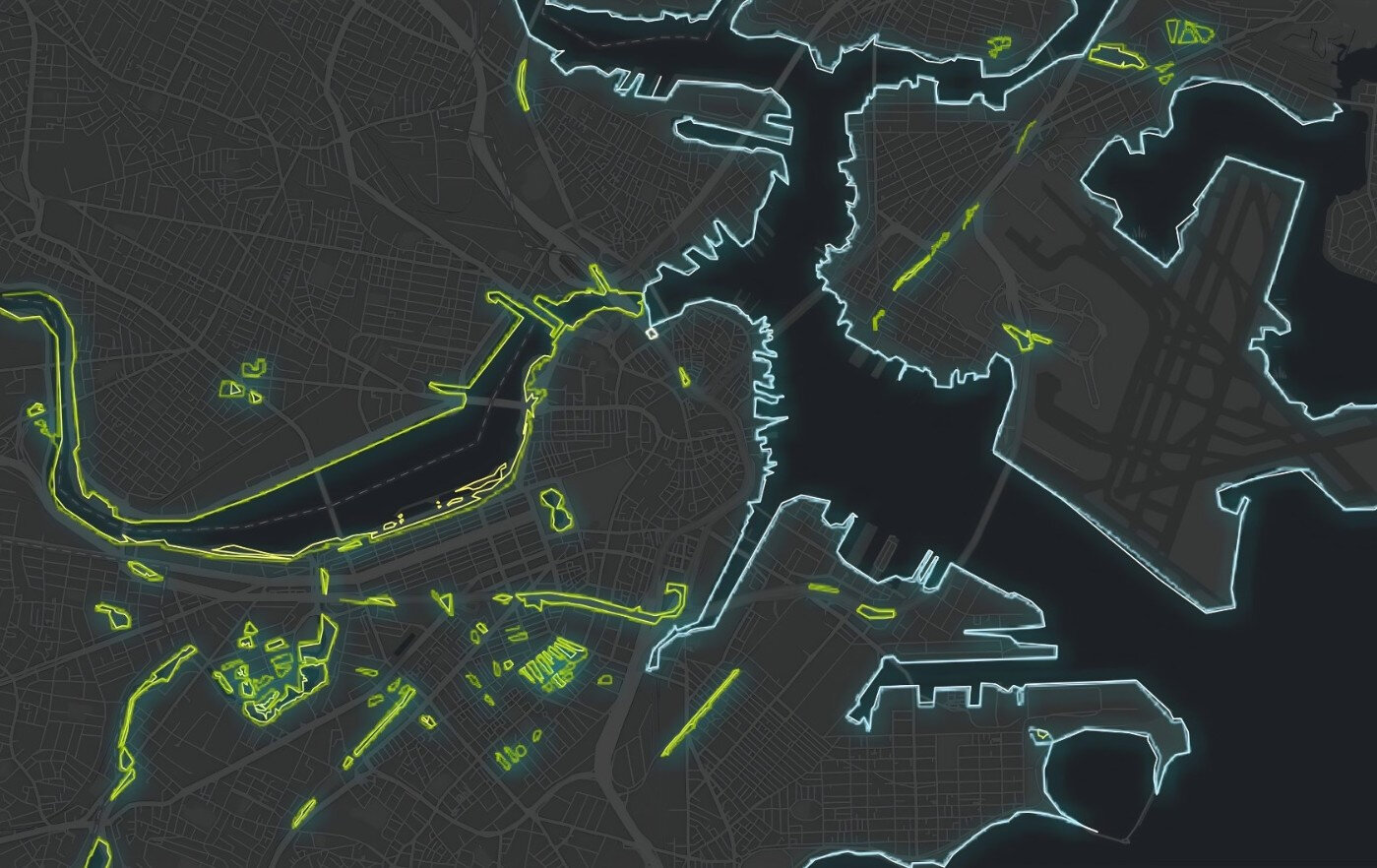
An early ArcGIS prototype: change in coastline for 1-foot sea level rise, rendered in high-contrast neon for screen.
The turn
From pixels to thread
The data was sharp but the artifact felt easy to scroll past. A printed map is something you glance at. A textile is something you stand in front of.
We decided to translate the composite map into hand embroidery on a single large piece of muslin. Each sea level scenario became a different stitch and shade of blue thread. The medium forced a different relationship with the data, where a line that takes a click to draw on screen takes hours to stitch by hand. The slowness is the point. It mirrors what sea level rise actually is, an inch every eight years on the Massachusetts coast, accumulating quietly until it isn't quiet anymore.
The making
Tracing, transferring, stitching
Reviewing the full-scale traced master before transfer.
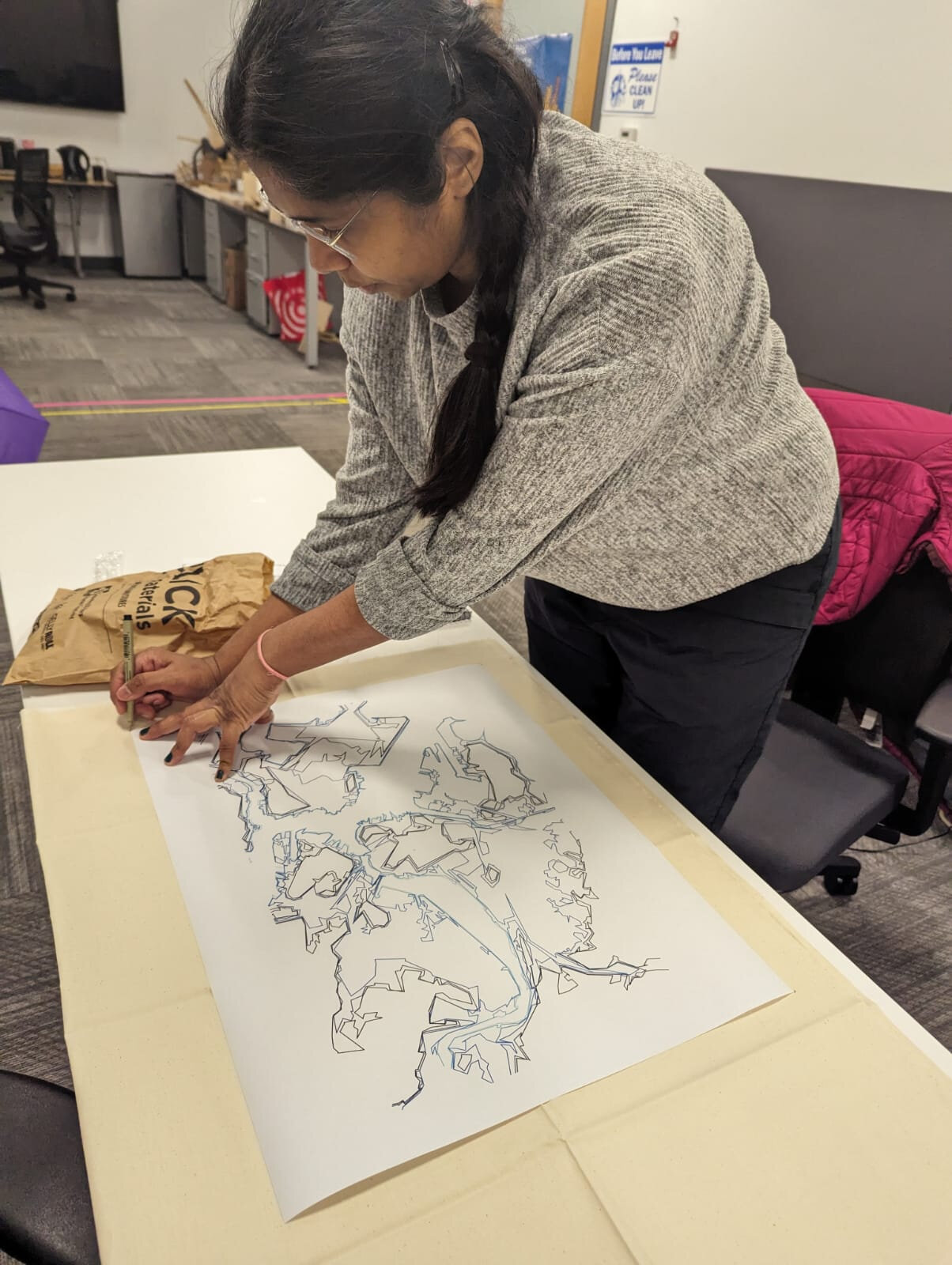
Tracing the composite sea level map onto paper by hand.
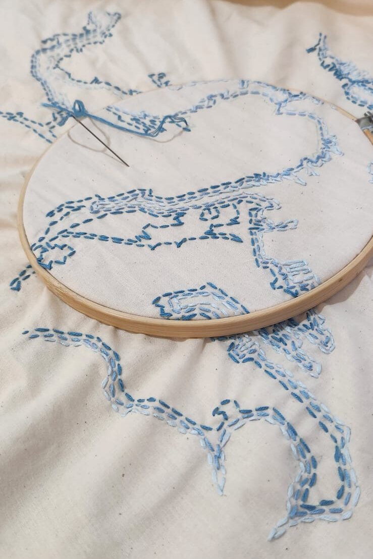
Stitching the contours on muslin, one sea level at a time.
The final piece
Uncharted Tides, stitched
The finished textile is roughly three feet wide. It carries the title, an embroidered legend for the five scenarios, and small thread markers locating familiar places, the New England Aquarium, TD Garden, Fenway Park, MIT, and the Northeastern College of Arts, Media and Design. The landmarks let viewers anchor themselves in their own routines before reading the futures stacked around those routines.
In the final critique, viewers leaned in close. Several traced the lines with a finger. That was the response the digital prototypes never got.
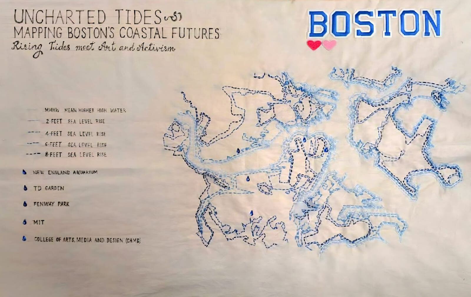
The final embroidered piece, muslin, cotton floss, approx. 36 inches wide.
Opening panel of the StoryMap.
Digital companion
A scrolling version of the argument
Alongside the textile we built an ArcGIS StoryMap that walks through the same material in a web format, from the Shawmut maps and the hidden hydrology of the Back Bay to the layered sea level scenarios. The StoryMap and the embroidery are meant to sit in conversation, one fast and scrollable, one slow and physical.
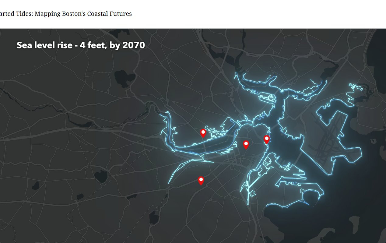
Sea level rise of 4 feet, projected for 2070.
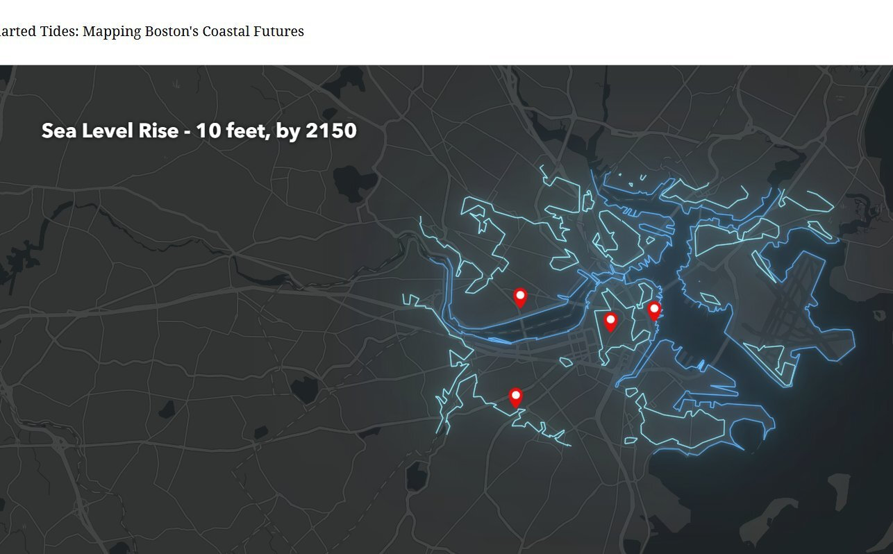
Sea level rise of 10 feet, projected for 2150.
Reflections
What changed for me
I came into the project expecting to make a visualization of data. I left having made an artifact that happens to be a map, and that shift is the part I keep thinking about.
The data didn't get more accurate when we moved it into thread. NOAA's numbers don't care what medium I render them in. What changed was the rate at which a viewer could ignore them. A web map invites scrolling. A piece of stitched cloth invites standing still. For a topic like sea level rise, where the public health of the story depends on people actually staying with it long enough to feel implicated, the medium is the argument.
The other thing that stayed with me is how much of climate visualization defaults to scary, and how often scary becomes background noise. The piece is quiet. The blue is soft. The viewer has to do the work of recognizing what they're looking at. I think that does more than another dramatic red overlay would have.